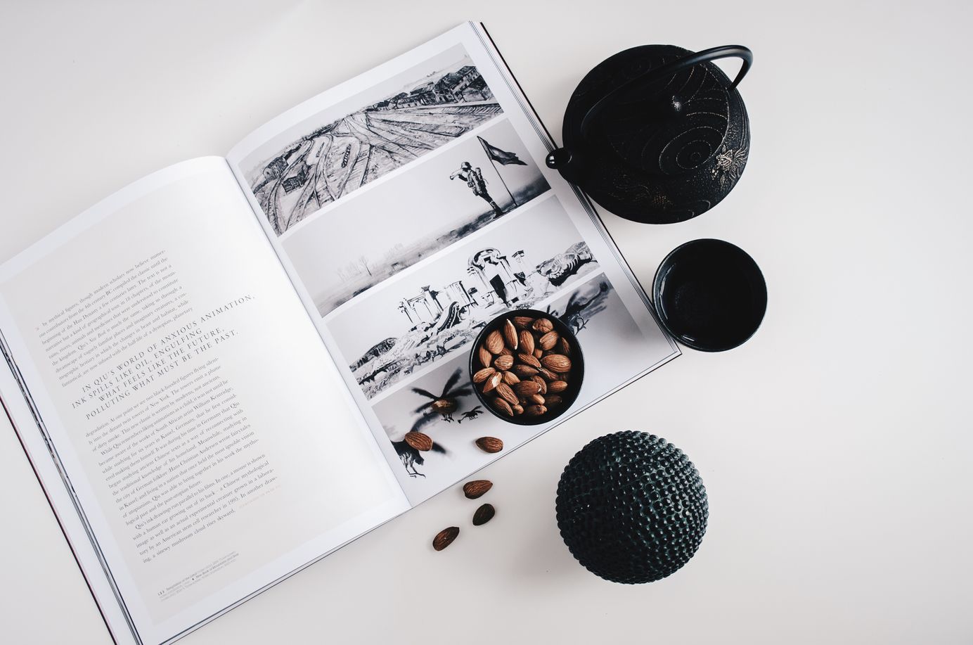
Elements
Penang is designed for you. Penang focus on showing your content in a clean and simple way, focus on images, typography, and white space.
Table of Contents
At Aspire Themes I use a lot of tools to help me create WordPress, Ghost and Jekyll themes. Tools will range from development, design, services, hosting and automation.
Graphic design is the paradise of individuality, eccentricity, heresy, abnormality, hobbies, and humors. — George Santayana.
Typography Drop Caps
Chris launched CW Moto Racing / Counter Weight Motorsport in early 2020 with a stack of business cards and a plywood work bench he hand-built from scrap materials in the garage. A year in, he's busy with race bike builds and track prep, and with preparation for the 2021 MotoAmerica.
Chris launched CW Moto Racing / Counter Weight Motorsport in early 2020 with a stack of business cards and a plywood work bench he hand-built from scrap materials in the garage. A year in, he's busy with race bike builds and track prep, and with preparation for the 2021 MotoAmerica.
Chris launched CW Moto Racing / Counter Weight Motorsport in early 2020 with a stack of business cards and a plywood work bench he hand-built from scrap materials in the garage. A year in, he's busy with race bike builds and track prep, and with preparation.
Chris launched CW Moto Racing / Counter Weight Motorsport in early 2020 with a stack of business cards and a plywood work bench he hand-built from scrap materials in the garage. A year in, he's busy with race bike builds and track prep, and with preparation for the 2021 MotoAmerica.
Chris launched CW Moto Racing / Counter Weight Motorsport in early 2020 with a stack of business cards and a plywood work bench he hand-built from scrap materials in the garage. A year in, he's busy with race bike builds and track prep, and with preparation for the 2021 MotoAmerica.
Chris launched CW Moto Racing / Counter Weight Motorsport in early 2020 with a stack of business cards and a plywood work bench he hand-built from scrap materials in the garage. A year in, he's busy with race bike builds and track prep, and with preparation.
Content Notes
Caption text size is smaller than the recommended size for general reading. On web, it should be used only in a graph or as a timestamp for a list item. On Android and iOS, it can also be used as help text or as other kinds of secondary text.
Caption text size is smaller than the recommended size for general reading. On web, it should be used only in a graph or as a timestamp for a list item. On Android and iOS, it can also be used as help text or as other kinds of secondary text.
Caption text size is smaller than the recommended size for general reading. On web, it should be used only in a graph or as a timestamp for a list item. On Android and iOS, it can also be used as help text or as other kinds of secondary text.
Caption text size is smaller than the recommended size for general reading. On web, it should be used only in a graph or as a timestamp for a list item. On Android and iOS, it can also be used as help text or as other kinds of secondary text.
Caption text size is smaller than the recommended size for general reading. On web, it should be used only in a graph or as a timestamp for a list item. On Android and iOS, it can also be used as help text or as other kinds of secondary text for list items.
Embedded Subscribe Forms
The important thing is that there is a wide range of people who might have some disabilities and by ignoring them you will make their life harder and they will end up leaving, but the web should be available to everyone.
Krabi Newsletter
Join the newsletter to receive the latest updates in your inbox.
List Items
- Ut at interdum nunc. Maecenas commodo turpis quis elementum gravida.
- Nunc ac sapien tellus. Quisque risus enim, tempus eget porttitor.
- Donec nibh massa, rutrum a sollicitudin eu, lacinia in lorem.
- Ut at interdum nunc. Maecenas commodo turpis quis elementum gravida.
- Nunc ac sapien tellus. Quisque risus enim, tempus eget porttitor in.
- Donec nibh massa, rutrum a sollicitudin eu.
Quote
“Graphic design is the paradise of individuality, eccentricity, heresy, abnormality, hobbies, and humors” — George Santayana
Ghost comes with a beautiful default theme called Casper, which is designed to be a clean, readable publication layout and can be adapted for most purposes. However, Ghost can also be completely themed to suit your needs. Rather than just giving you a few basic settings which act as a poor proxy for code, we just let you write code.
Bookmarks

Like what you see?
We've crammed the most important information to help you get started with Ghost into this one post. It's your cheat-sheet to get started, and your shortcut to advanced features.
Media Embeds
PurposeTaken from a collection of 1200 interviews on the streets of New York City, this week's episode features people searching for a purpose.
Gepostet von Humans of New York: The Series am Donnerstag, 21. September 2017
Very excited to release Nubia, a new Responsive & Multipurpose Ghost Theme 🚀🚀https://t.co/LATsykOLDJ pic.twitter.com/zG2PFVwe7G
— Aspire Themes (@aspirethemes) December 24, 2017
Ghost comes with a beautiful default theme called Casper, which is designed to be a clean, readable publication layout and can be adapted for most purposes.
Product Card
However, Ghost can also be completely themed to suit your needs. Rather than just giving you a few basic settings which act as a poor proxy for code, we just let you write code.

Product Title
Ghost comes with a beautiful default theme called Casper, which is designed to be a clean, readable publication layout and can be adapted for most purposes.


Syntax Highlighting
'use strict';
var markdown = require('markdown').markdown;
function Editor(input, preview) {
  this.update = function() {
    preview.innerHTML = markdown.toHTML(input.value);
  };
  input.editor = this;
  this.update();
}
You can add inline code just like this, E.g. {{image absolute="true"}}
pre {
  background-color: #f4f4f4;
  max-width: 100%;
  overflow: auto;
}
Input Style
Buttons Style
<button class='c-btn c-btn--small'>Small Button</button>
<button class='c-btn'>Default Button</button>
<button class='c-btn c-btn--full'>Full Button</button>
<button class='c-btn c-btn--action c-btn--small'>Small Button</button>
<button class='c-btn c-btn--action'>Default Button</button>
<button class='c-btn c-btn--action c-btn--full'>Full Button</button>
<button class='c-btn c-btn--action c-btn--loading'>Full Button</button>
<button class='c-btn c-btn--action c-btn--loading c-btn--full'>Full Button</button>
<button class='c-btn c-btn--loading'>Full Button</button>
<button class='c-btn c-btn--loading c-btn--full'>Full Button</button>
Footnotes
Footnotes allow you to add notes and references without cluttering the body of the document. When you create a footnote, a superscript number with a link appears where you added the footnote reference. Readers can click the link to jump to the content of the footnote at the bottom of the page.
Here's a simple footnote,[1] and here's a longer one.[2]
